Website design runs in waves, as it evolves toward greater simplicity and greater complexity, easier to use and easier to muck up. I’d rather call these fashions or trends, as sometimes they’re as much about the look as the functionality.
Just like in clothing, if one doesn’t care to follow these year’s look closely, you just might embarrass yourself if you don’t Goodwill those bell-bottoms. Wait a moment, maybe scrap the straight-legs for the New Year?
There is a serious side, though. Ensuring a website is easily navigable on phones and tablets, even if it looks by necessity differently than the larger screens of desktop computers and laptops, is a must. That’s called “responsiveness,” by the way.
It has been time for me to upgrade the set of templates WordPress calls themes for a year maybe longer. Approved themes whose developers continue to update them as needed generally work fine on small screens. Some appear nicer, friendlier, even more stylish than others. Might as well be current. (Old looking websites are distracting (call attention to themselves and negatively at that) and imply inattention by the site’s owner if not webmaster.)
Finally moved matters over and around a month ago, in both the main benpollock.com and the blog section benpollock.com/brick. The next to last time for Brick was 9 1/2 years ago, May 2012, with the theme Erudite, documented in Theme (Swan) Song. Years later I moved Brick to Penscratch, but it got old and its developer removed it.
A year or two later I moved Mirthology to the WordPress annual default theme Twenty Thirteen. WordPress keeps its own themes up to date on the technical side, but for some webbies, that’s the best they can say about them.
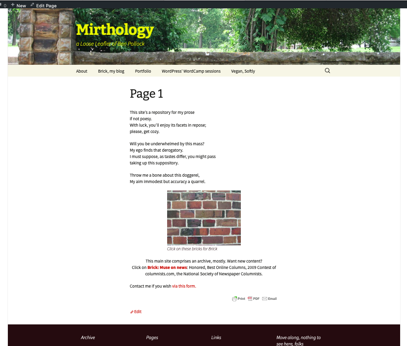
Screenshot of the top of Mirthology benpollock.com from before Nov. 29, 2020. The website for several years used the WordPress Twenty Thirteen theme. 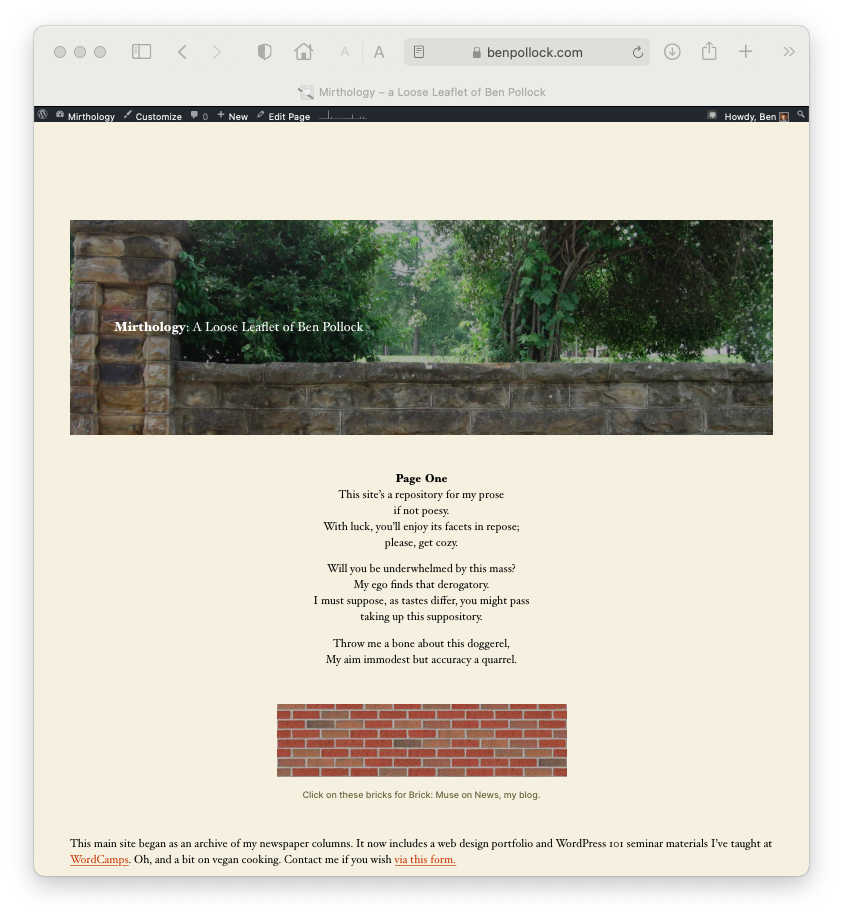
Screenshot of the top of Mirthology benpollock.com after Nov. 29, 2020, on the Twenty Twenty WordPress theme
Another factor besides “responsiveness” to different window sizes and ratios is “accessibility” for those living with disabilities. Folks with poor vision use screen readers that read text aloud. On the earlier image of the top of Mirthology’s home page, the words are superimposed within the picture file, nothing to be read by a ‘bot. On the new theme, the words can be heard when the screen reader comes across them.
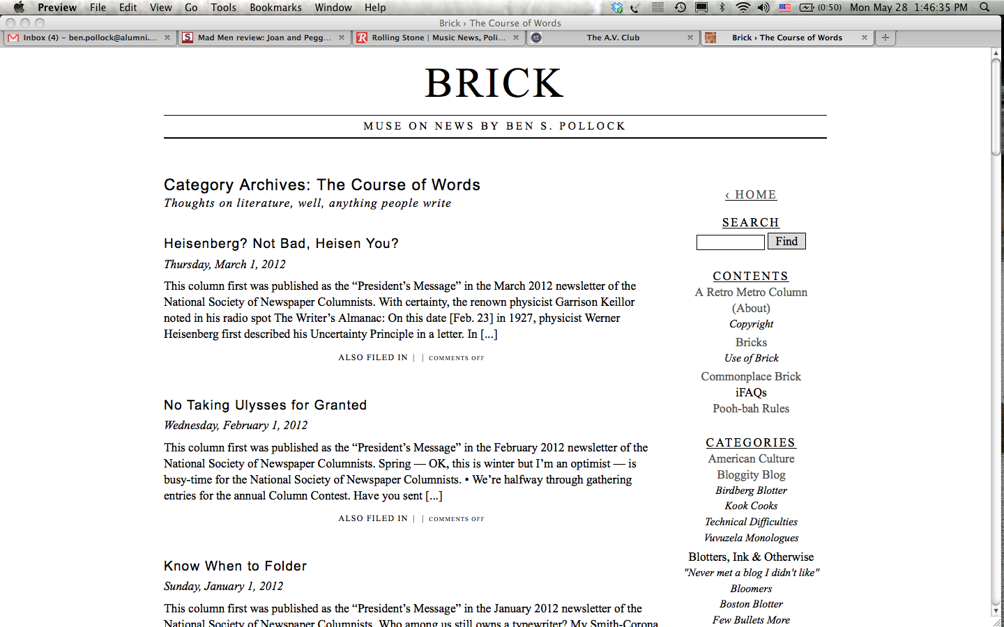
Screenshot of the top of Brick benpollock.com/brick from before Nov. 29, 2020. It used the Penscratch theme, which is no longer available. 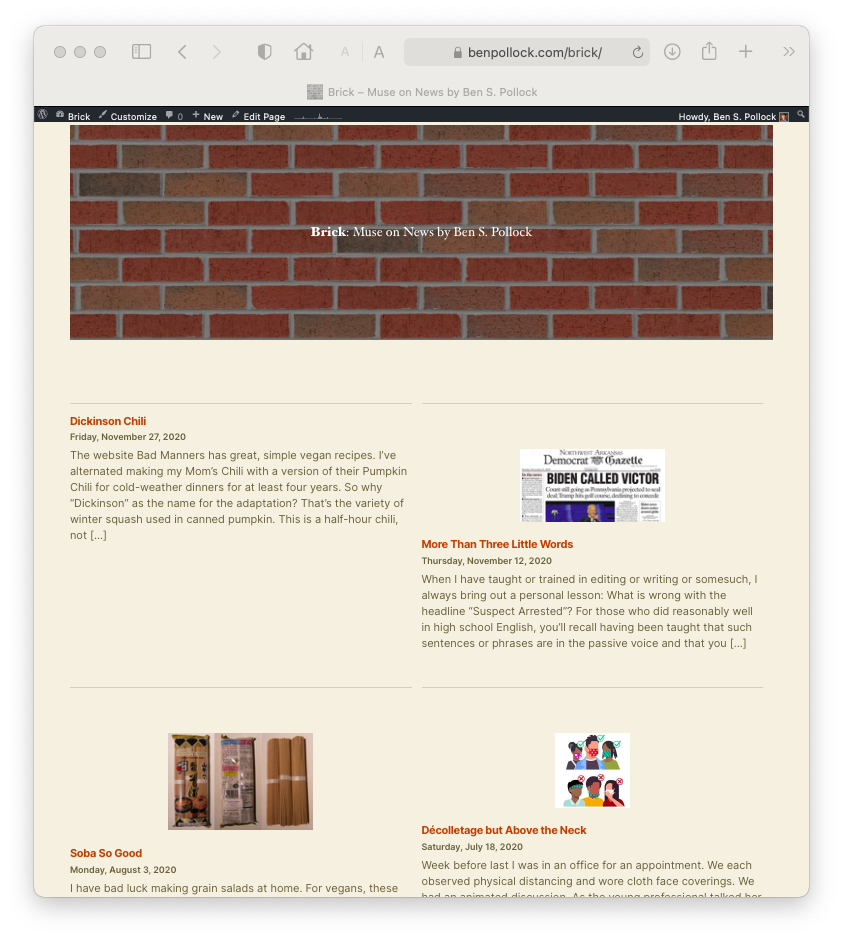
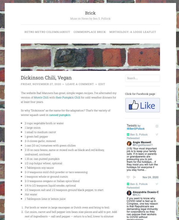
Screenshot of the top of Brick benpollock.com/brick after Nov. 29, 2020, on the Twenty Twenty WordPress theme
I spent a couple of months looking at many dozens of themes. When I teach a basics session at WordCamp, which I’ve done for several years here in Fayetteville, I discuss choosing one. If I’m not careful, weighing the pros and cons of various themes eat up way too much of the hour, and I don’t want to lose anyone now. (So come to the next WordCamp in your town!)
Twenty Twenty is clean, easy on the eye, doesn’t call attention to itself, right? I don’t care for the wide spaces between elements when seen on desktop. It could be fixed in coding, but on principle I don’t do that. It’s irritating more than aggravating, right? When everything else is so sleek.
It’ll sure do for now.
